Reading Redesign
Enhancing the reading experience of college students
01. Background
The Objective
College students face unique challenges, such as managing dense textbooks, organizing information for exams and projects, and balancing academic demands with personal interests. The goal of this project is to develop an app that caters to college students' academic and personal reading needs by offering a streamlined and intuitive platform that supports efficient study habits, critical engagement with content, and improved retention of material.
02. Research
Competitive Analysis
To gain insight into the UX strategies utilized by established reading apps, I conducted an analysis of the app Blinkist.
Here were my findings:
The app prioritizes quick and easy access of key ideas and information, and present them as key notes for people to grasp the overall concept and content of the book, which supports people that doesnt want to spend too much time reading a lengthy book
Exploration
The app has a personalization system where they suggest books like the ones you're reading, and filter books by genre and categories highlights that would provide users more discovery options
Dynamic Consumption
The audio option enables and encourages the user to listen to books while multitasking, even though it might not be applicable for all users
Lack of In-Depth Analysis
While Blinkist provides a good overview, it's not designed for deep dives into complex subjects. Users who need to critically analyze a book or engage with its nuances might find the summaries insufficient.
Negelate Academics
Blinkist summaries are not a substitute for reading original texts, especially for academic purposes. Users who need to cite sources or engage in scholarly work will need to go beyond the app.
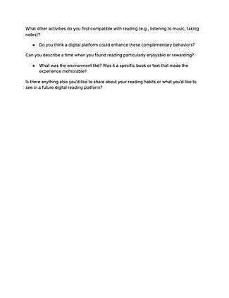
User Interviews
I conducted a series of interviews with college students of varying reading habits and studying preferences to better understand their perspectives and individual needs.
Takeaways
-
Many students struggle with maintaining focus, especially on dense or unengaging material, highlighting a need for tools to boost concentration.
-
Reading habits vary based on availability, environment, and content type. Students adapt their routines to fit academic and personal demands.
-
College students often juggle multiple responsibilities, such as coursework, extracurricular activities, and part-time jobs, making multitasking common.

03. Ideation
HMW
After my research I looked into "How Might We?" questions I would want to focus on for my app. Ultimately, I had decided on "How might we help users maintain focus while reading?"
Storyboarding
To enhance my comprehension of the user experience on my potential app, I generated storyboards to illustrate a possible user journey.
Feature List + Sitemap
My next steps were to map out the core structure and highlighted features for my app, focusing on my target audience of college students.
Feature List
-
Pomodoro Timer
-
Timer based on the Pomodoro Technique to encourage focus for the reader. This timer will “lock” the reader into the book they are reading and will be able to be seen throughout the user’s reading of the text.
-
-
Note-Taking
-
A clickable button will pop-up a section for the reader to write/type notes during their reading.
-
-
Highlighter
-
The reader can choose a highlighter marker to highlight important information.
-
-
Document Importation
-
The reader can import documents to the app, allowing them to insert readings from courses/the internet/etc...
-
-
Customization
-
Options will be provided to select specific options to read, text/background colors, session times, timer settings, audio enabling, etc...
-
-
Folders
-
Readers can organize their downloads into specific folders for easier navigation.
-
-
Search Bar
-
Readers can easily find their documents by searching up related terms.
-
-
Progress Dashboard
-
An illustrated “bookshelf” will be available to readers to see stats such as average reading time, books in progress, new records, etc...
-
Sitemap
Workflow
I then took one main workflow to demonstrate from the sitemap that I had created. The goal of this workflow was to stay focused while reading and the task was to create a timed reading session for a downloaded book.
Wireframes
To conceptualize the UI designs for the app, I roughly drew several variations of wireframes that would eventually be transformed into mid-fidelity wireframes.


04. Prototype
First Iteration
Using my rough sketches, I was able to develop mid-fidelity wireframes to progress towards the final fleshed-out prototype.
Critique
I performed user testing, analyzing which heuristics were missed and which were demonstrated. While watching my participant navigate through my screens, I noted what I would look to change in my final deliverables.
-
Clear design
-
Feedback: Participant enjoyed the simplistic design and how her eyes were guided to one clear button—the “Let’s read” button.
-
Adjustment: I would keep this minimalist design and consider doing something fun with the reading button to encourage the user.
-
-
Confusing word choice
-
Feedback: Participant seemed to get confused when this notification popped-up. It almost seemed to surprise her as if she had done something wrong and caused her to click outside of the box.
-
Adjustment: The word “cancel” can seem a little stressful for someone studying. I would look to use alternative words such as “dismiss” or “close”.
-
-
Adjusting heuristics
-
Feedback: Participant commented that she wished the her eyes went to the encouraging message at the final screen rather than the achievements.
-
Adjustment: I would take a look back at what features I truly want to highlight then possible enlarge/minimize certain aspects.
-
Style Guide
To outline the overall look and feel of my app, I created a style guide. This allowed me to build a more cohesive and consistent design throughout my screens.
Final Designs
I took the feedback from my user testing into consideration in order to develop my app, and applied the style guide into my design.


05. Reflection
Upon completing this project, I was able to reflect on the journey of designing the user interface for a timer-based reading app and understand the complexity of creating a seamless experience for users with varying needs and goals. Being a college student who struggles with maintaining focus myself, I was surprised at what I could learn from the advice of my peers, which stressed the importance of user testing. This project demanded not only technical proficiency but also a deep understanding of user psychology and behavior, especially when it comes to focus and productivity.